Here's a catch-up post on the station building at Farthing.
Windows and Doors
The main station building at Farthing is a model of the prototype at Newbury. It was built in the “Westbury” style used on a number of new GWR stations in the 1900s. A typical feature was the rounded corners and small upper glazing bars on windows and doors.
I experimented with different ways of making the upper glazing bars, with input from other modellers over at RMweb - thank you!
Method 1: Scribe, paint, wipe. This time-honoured method gives some neat results. On this occasion I felt that the glazing bars were – ironically - a bit too fine.
Method 2: Sticky-backed paper on clear styrene. Another classic. I struggled to cut the paper neatly, though further experiments might have helped.
Method 3: Laminated layers of styrene. My Silhouette cutter struggles with fine bars, but by laminating three layers I got a decent result - so I went for this approach.
The windows and doors were drawn up in Inkscape. I simply imported drawings and photos of the prototypes into the software and drew on top of them.
The doors and windows were then copied into the overall drawing.
This allowed me to cut full sheets using the Silhouette, using 5 thou Evergreen styrene.
The layers were then laminated.
A trial fit of the sheets behind the walls. Stone coloured doors and white window frames would have looked nice.
But in the 1900s Newbury had chocolate doors and windows. This is clear from period photos and was common at the time – although GWR livery guides tend to overlook it.
The window- and door sheets were then stuck behind the walls.
One thought occurred to me: Bath stone + chocolate doors and windows = Chocolate and cream! Just a coincidence?
One of the gables had half-blinded windows as built. At some later point in history the other gable received the same treatment.
My downpipes were a fiasco. The square prototypes are neatly recessed in the brickwork, but I forgot to provide for that when building the walls. An attempt to carve out the channels failed.
As a compromise, I have fitted them on top of the bricks instead. But maybe I should just leave them off entirely, rather than having wrong ones.
The Refreshment Room
The original frontage of the refreshment room at Newbury is still there, and still houses a café.
Stratford on Avon refreshment room. Source: Embedded from WarwickshireRailways.com
I initially thought that the design was unique to Newbury, but then found the above photo showing the refreshment rooms at Stratford on Avon, built 1908 on the new island platform.
Banbury refreshment room, 18 October 1935. Source: Getty Images, embedding allowed
Recently I also found this photo, showing the refreshment room at Banbury in the same style. An article in the Banbury Advertiser of February 11, 1904, indicates that the plans were drawn up by the GWR’s P.E. Culverhouse, who later in life (1929) became the company’s Chief Architect.
Carmarthen refreshment room. Source: Wikipedia Commons.
I bet the current buffet at Carmarthen, built 1902, was also in that style originally. The September 1902 issue of the GW Magazine describes it as “a stylish refreshment room with cathedral glass frontage, the whole being built over roomy, arched, cool cellars for the storage of wines, etc.”.
The Refreshment Room at Reading in Edwardian days
Refreshment rooms were a sizeable operation on the GWR. In 1890 there were 14, by 1907 there were 104 at 38 stations. In 1913 there were 120. They were originally leased out, but from 1890 increasingly came under direct control of the GWR Hotels & Refreshment Dept. (Source: GW Magazine July 1907 and June 1913).
Women volunteers running the free buffet at Paddington station, c 1914. Source: Getty Images, embedding allowed.
Large stations had different classes of Refreshment Rooms. Photos tend to focus on First Class, but perhaps the above view from Paddington in 1914 – though taken under special circumstances – gives an impression of a Third Class refreshment room.
Tea room at the Great Western Hotel, Paddington Station, London, 1922. Source: Getty Images. Embedding allowed.
Most Refreshment rooms were primarily designed as buffets with limited seating. Larger stations then also had Tea Rooms or Restaurants for proper meals. Though Paddington's were surely in a league of its own!
Back to modest Newbury. The panelled frontage of the refreshment room was again made using the layered approach.
Trial fit of the laminated sheets. On this frontage the glazing bars were extra fine and I should probably have used the scribing technique here. Too late now.
The decorative features were built up from styrene rod and strips.
I went for a combination of Chocolate + Stone No. 1 and 2. Such a combo can be seen in some 1900s photos of timber framed station buildings. That said, I am wondering if the whole thing was Chocolate.
The Newbury Weekly News, June 17 1909 describe the station’s new Refreshment Room as follows: "The walls are panelled in fumed oak, and the counter is of similar construction, with a rouge marble top. The windows are filled with cathedral glass of pretty design, and the general effect is one of comfort and convenience...”.
I don’t know what the stained-glass pattern at Newbury looked like. Above is Birmingham Snow Hill in 1910. A perusal of photos suggests that cathedral glass was common in GWR refreshment rooms at the time – also at medium sized stations - but that there was no standard design or pattern.
My first attempt was based on the Snow Hill pattern, drawn up in Inkscape, coloured in Paintshop Pro and printed on matt transfer paper. Unfortunately it just looked like christmas decorations!
So instead I used colour photos of antique Edwardian windows from the web, modified to suit and this time printed on Xerox Premium transparency paper and using a better printer.
I incorporated a reduced version of the above panel in the door design. It was rescued by Peter Edmonds from the old refreshment rooms at Westbury station and restored by the GWS in memory of the late John Goodman. Thanks to Nick Gough who kindly shared the photo.
The glazing in place. The Westbury logo doesn't show up well, but at least it is there in the door. The top windows will just be plain glazing, otherwise it will all be a bit much.
The appearance is arguably a bit too transparent for cathedral glass, but the interior will be unlit so I think the effect will be OK.
The Tea Room Enigma
Next to the Newbury Refreshment Room was an aperture in the wall which looks like this today – a bit of a mystery for me.
The original drawing shows it simply as a blank space and refers to a separate drawing that I do not have. I was therefore excited to find that the June 17, 1909, edition of the Newbury Weekly News states: “Adjoining the main restaurant is a tea-room, quite distinct...". Thanks to David Peacock of the Berkshire Industrial Archaeology Group for this information.
I have no period photos of the Tea Room, so simply made a guess and replicated the design from the Refreshment Room. There's no door, as the current one is a 2022 addition. Access would have been via the Refreshment Room and/or the adjoining hallway.
I couldn‘t resist a different pattern of stained glass here. The Newbury Weekly News did say “quite distinct”!
Then recently I spotted what appears to be a news stand in this heavily cropped 1940s Newbury photo. It is located where I thought the Tea Room was! Looking at other stations built during this period I am now inclined to think that the aperture was in fact for a newsstand, while the Tea Room faced the other side of the building. I’ll weigh the evidence further. Meanwhile I’m enjoying the mystery. We don’t have to know everything at once.
Doorknobs and -plates
I used short handrail knobs to represent door-knobs. The holes are in the vertical plane so can’t be seen once the canopy goes on.
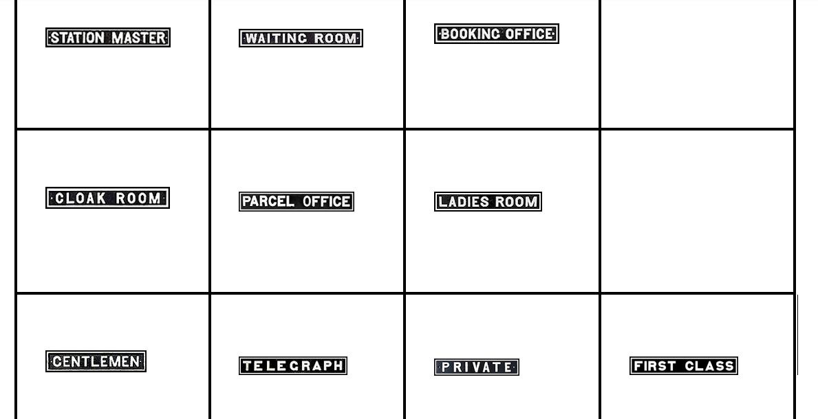
Doorplates were common at GWR stations, though I don’t know if there were periods differences. Above is a crop from a photo of Lambourn station when built in 1910.
Photos of actual GWR doorplates were found with a Google Image search. They can also be made in Word using available GWR fonts. The latter actually comes out neater, but I like the idea that the signs at Farthing are from real GWR stations.
I reduced the plates to scale and printed them on normal paper.
The door plates are stuck on temporarily and not finalized, as I don’t have a floorplan of the prototype at Newbury (I’ve contacted Network Rail, but no response). I am drawing up an assumed floor plan thanks to good help and advice over on RMweb.
An overall view of the platform side. Currently working on posters and poster boards, another rabbit hole!


.jpg)


.jpg)


